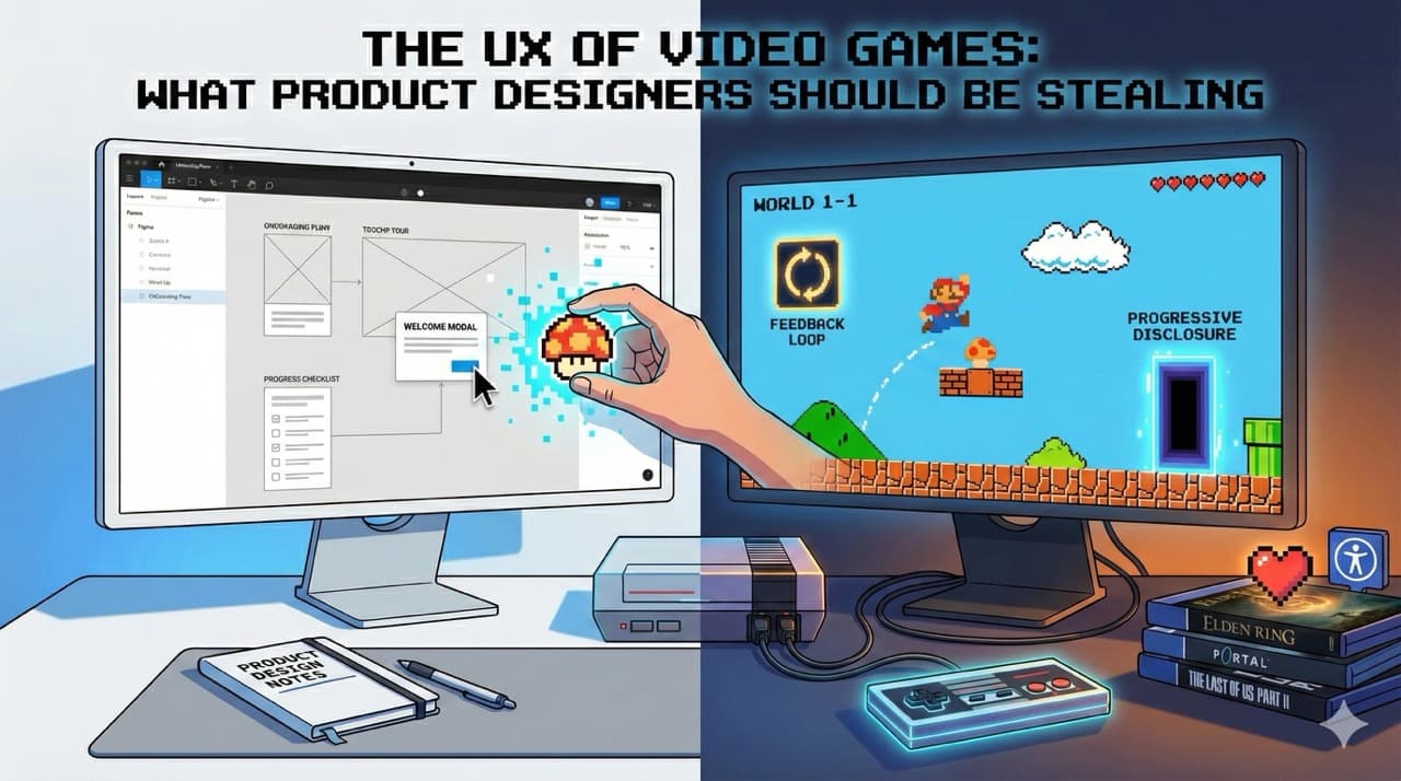
Product designers love to talk about onboarding flows, progressive disclosure, feedback loops, and user engagement. We attend conferences about it. We read books about it. We create elaborate Figma files documenting it. And yet, video games have been doing all of this, often brilliantly, since before most of us had email addresses. The games industry has been running the world's largest UX experiment for over forty years, and most product designers are barely paying attention.
I've spent the better part of two decades working in product design. I've also spent the better part of four decades playing video games. And it took me an embarrassingly long time to realise that the second hobby had been quietly teaching me how to be better at the first.
Product designers love to talk about onboarding flows, progressive disclosure, feedback loops, and user engagement. We attend conferences about it. We read books about it. We create elaborate Figma files documenting it. And yet, video games have been doing all of this, often brilliantly, since before most of us had email addresses. The games industry has been running the world's largest UX experiment for over forty years, and most product designers are barely paying attention.
That needs to change.
Onboarding: The Art of Teaching Without Lecturing
Let's start with the big one. Every product designer has wrestled with onboarding at some point. How do you take a new user who knows nothing about your product and get them to a point where they're confident, competent, and ideally enjoying themselves? Most of us reach for the same toolkit: tooltip tours, welcome modals, empty states with helpful illustrations, maybe a progress checklist if we're feeling fancy.
Games figured this out decades ago, and they did it with far more complexity to communicate.
Think about Super Mario Bros. World 1-1 is probably the most analysed piece of design in gaming history, and for good reason. Within the first thirty seconds, without a single line of instructional text, the game teaches you how to move, jump, collect items, and defeat enemies. The first Goomba walks towards you at exactly the right speed to force you into action. The first mushroom appears from a block you were going to hit anyway. The first pipe is positioned to teach you about exploration. It's all intentional. Every pixel placement was a design decision.
Now compare that to the average SaaS onboarding flow: a seven-step tooltip tour that nobody reads, pointing at interface elements that don't mean anything to a new user yet. We could learn a thing or two.
The Legend of Zelda: Breath of the Wild took this concept and turned it into something even more sophisticated. The Great Plateau, the game's opening area, is essentially a giant tutorial. But most players don't even realise it. Nintendo constrained the space just enough to guarantee you'd encounter the core mechanics (climbing, cooking, combat, physics) without ever telling you "now learn this." You learn by doing, by experimenting, by failing and trying again. By the time the game opens up into the full map, you've internalised everything you need without ever feeling like you sat through a lesson.
The product design equivalent? Stop front-loading your education. Let people discover features in context, when they actually need them. The best tutorial is one the user doesn't know they're in.
Feedback Loops: The Reason You Can't Stop Playing
Here's something games understand better than almost any other medium: humans need feedback. Constant, immediate, satisfying feedback. Press a button, something happens. Defeat an enemy, hear a sound, see a number, feel a vibration. Everything in a well-designed game is telling you something about the consequence of your actions.
From Software's Elden Ring is a masterclass in this. Every swing of your weapon has weight. Every dodge has consequence. The game is brutally difficult, but it never feels unfair because the feedback is so precise that you always know what went wrong. You died because you dodged too early, not because the game cheated you. That clarity keeps players coming back despite dying hundreds of times.
In product design, we often forget this. A user clicks a button and nothing happens for three seconds. A form submits and there's no confirmation. A file uploads and the only indication is a barely visible spinner in the corner. We're leaving our users in a feedback vacuum, and then we wonder why engagement is low.
Games teach us that feedback doesn't have to be complicated. It just has to be immediate, clear, and proportional to the action. A small action gets a subtle response. A big action gets a celebration. Duolingo, to its credit, borrowed heavily from gaming here, and it's no coincidence that it's one of the most engaging products on the planet.
Progressive Disclosure: Don't Show Everything at Once
One of the biggest mistakes I see in product design is the kitchen sink approach. Here's your dashboard. Here are forty-seven features. Here's a sidebar with twelve sections. Good luck.
Games never do this. Or rather, good games never do this.
Portal is the textbook example. The entire game is built around a single mechanic: you shoot portals. But the game doesn't hand you two portals from the start and say "off you go." It gives you one portal. It lets you understand that. Then it gives you the second. Then it introduces momentum. Then lasers. Then companion cubes. Each new element builds on what you've already mastered, and by the end you're solving puzzles that would have seemed impossible in the first hour.
Hollow Knight does something similar with its exploration. You start with basic movement and a sword. Over the course of the game, you unlock a dash, a wall jump, a double jump, and eventually the ability to fly. Each new ability opens up areas of the map that were previously inaccessible, giving you a reason to revisit old locations with fresh eyes.
Product designers should be obsessed with this approach. Don't dump every feature on a new user. Give them what they need right now, and reveal more as they grow. Let features unlock as users demonstrate they're ready for them. It's not gatekeeping; it's good design.
Accessibility: Games Are Leading the Way
This one surprised me. For years, gaming had a reputation for being hostile to anyone who wasn't a twenty-something with lightning reflexes. But the industry has made remarkable strides, often outpacing the product design world in the process.
The Last of Us Part II shipped with over sixty accessibility options. Sixty. You could customise everything from controller remapping to audio cues for visual elements to automatic aim assistance. Naughty Dog didn't just add a colourblind mode and call it a day. They fundamentally rethought how their game could be experienced by different people with different needs.
Meanwhile, most web products are still failing basic colour contrast checks and shipping forms that can't be navigated with a keyboard. Gaming is showing us that accessibility isn't a checkbox at the end of a project. It's a design philosophy that should be baked in from the start.
Emotional Design: Making People Feel Things
This is the one that product designers really struggle with. We're good at making things usable. We're good at making things efficient. But making people actually feel something? That's where games run laps around us.
When I think about the opening hours of Red Dead Redemption 2, trudging through the snow with Arthur Morgan's gang, the game wasn't teaching me mechanics or showing me features. It was establishing mood, building relationships, making me care about fictional people. By the time the game opened up, I wasn't just playing it. I was invested.
Stray made me care about a cat. Not through cutscenes or dialogue, but through animation, environmental storytelling, and that little button that let you meow whenever you wanted. The developers at BlueTwelve Studio understood that emotional connection doesn't come from grand gestures. It comes from small, thoughtful details that make an experience feel alive.
Product design could use more of this thinking. Not everything needs to feel like a tax form. The micro-interactions, the copy, the moments of delight when something works exactly as you hoped. These tiny touches are what separate products people use from products people love.
Stop Pretending Games Aren't Relevant
There's a strange snobbery in some corners of the design world that treats games as entertainment, as if that somehow makes them less worthy of study than a banking app or an enterprise dashboard. That's nonsense. Games are some of the most complex interactive systems ever designed, used by billions of people across every demographic you can imagine. They've been solving UX problems at scale for forty years with budgets that would make most product teams weep.
If you're a product designer and you're not paying attention to how games handle onboarding, feedback, progressive disclosure, accessibility, and emotional design, you're ignoring one of the richest sources of design knowledge available.
So go play some games. Call it research. I certainly do.